"A breathtaking fantasy adventure that we recommend to fans of Studio Ghibli and Hayao Miyazaki's works" - this is how the latest fantasy comic book published in Poland by the reliable Non Stop Comics is advertised. Referring to one of the most respected animation studios sets the bar very high. How much truth is there in that?
Yes, some similarities are noticeable. The plot is based on strong female heroines, such as in Princess Mononoke or Nausice from the Valley of the Wind. The circumstances of nature are also beautiful and mysterious. However, I would like to warn you right away that there is no specific component here – culture. Apart from the scarcity of the steampunk-like machines typical of Ghibli, I mean a deeper humanistic message about human influence on nature. Such ecological threads do not appear here (at least not in the first volume). Even aesthetically, Isola is closer to Western animated films than to the style known from Japanese productions.
The Bonita Island
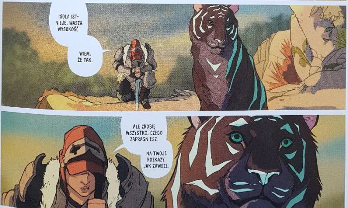
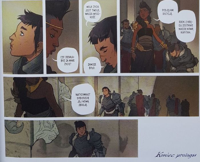
The story begins with a ten-page prologue in which Queen Olwyn unexpectedly appoints warrior Rook as the captain of her personal guard. The main part of the comic takes some time after this event. The guardsman comes to escort her ruler to the mythical Isola. The problem is that the queen now has four legs, fur and turquoise stripes – she was transformed into a tiger by magic. The protagonists face many challenges – they have to escape from the guards from the kingdom of Maar and be on guard against poachers, for whom fur is a valuable commodity. Thus, the combination of the fantasy genre and the road comic begins. The reader is initially thrown into deep water, as the course of the transformation of the ruler into a furry is revealed only at the end of the volume, and leaves many questions open.
Tiger out of water
Displaying in a comic book is a difficult thing. In literature, the narrator deals with explaining the world, sometimes over several pages. In the case of comics, square frames with the description of events / thoughts of characters are used extremely rarely nowadays, as they feel like a mouse. All narrative complexities must therefore be contained in a short form: either dialogue between characters, or in the introduction or afterword. Worse, if the author decides not to do any of the above and starts advanced world-creation without properly writing down the rules governing the universe he creates and communicating them clearly to the reader. A well-written world, even the most fantastic one, should have clearly understood rules and terminology. Monstressa had caused me some difficulties before(also from the Non Stop Comics stable), although at least there were pages with Nekomants who brightened up a bit. There is no such facility in Isola . Information about the depicted world is provided very casually. Fletcher did not choose a typical fantasy land full of elves and other dwarves (thankfully), instead he created a more original vision, but he lacked the space (or rather the idea) to describe everything properly. Thus, a kingdom appears here, but we know virtually nothing about it. I even have the impression that the very explanation of what Isola is does not appear on the pages of the story, but in the blurbon the back of the cover. The peoples inhabiting the kingdom are also scarcely presented – there is no history, no social background. A similar problem is consuming the heroes (despite the fact that the relationship between Rook and the queen was conducted well), whose past is completely unknown to the reader. It is a pity that Fletcher did not attempt any character (even secondary) from the outside, acting in accordance with the “fish out of water” trope, thus giving the reader an easy-to-swallow exposure. It is possible that the authors have already developed a general vision of the whole and the remaining volumes will be more pleasant to read, but introductions should not be created in this way.

Anikomiks
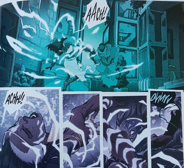
Zgłosiłem się do recenzji tego komiksu tylko na bazie przykładowych stron. Nie były dla mnie ważne nazwiska autorów ani opis fabuły – po prostu zapowiedź wyglądała tak zachęcająco. Kreska Karla Kerschla wygląda, jakby żywcem wyciągnięta została z animacji od Disneya czy innego Dreamworksa (a nie Ghibli). Czasami miałem wrażenie czytania anime comics, czyli tytułu stworzonego na bazie klatek z filmu (jak np. przerobione w ten sposób kinówki Dragon Ball). Potęgowane to było faktem, że większość kadrów w Isoliit looks very static. The pages are full of rectangles and squares, sometimes overwhelmingly. The Non Stop Comics edition is of standard size, and in the case of such a narrative density, the enlarged format typical for “francophones” would be much better suited . Nevertheless, Kerschl did a great job, which was beautifully colored by an artist named Msassyk. A great operation in her performance is to keep the pages in the same color (sometimes purple, in other places navy blue, etc.), which greatly affects the atmosphere of the scenes. It is once again a pity that the comic book is not bigger to appreciate the artistry of the graphic design.
Studio Ghibli isn’t even it
Keeping the convention of comparing comics with the Ghibli studio, the work of Fletcher, Kerschl and Msassyk is closer to Goro Miyazaki ( Tales from the Earthsea ) than to the genius of his father Hayao. Isola is very pretty, but it can also be tiring to perceive. The visual layer definitely dominates the plot here. I hope that the next volumes will present a more refined world-creation.